I designed and developed the personas, scenarios, and wireframes that were used for the final presentation in addition to contributing to all reports, user testing, and surveys.
Angie Carrier, Samantha Jones, Shu Wang
HIMSS is a cause‐based non‐profit organization focused on improving healthcare through information technology, and himss.org is the main website for HIMSS. HIMSS' audeience includes: professionals, clinicians, physicians, executives, students, and others who are interested in healthcare IT. A visitor to himss.org can find recent news, look for or post related jobs, conduct research, buy books, register for events and conferences, become a HIMSS member, and find ways to get involved with HIMSS.
HIMSS.org is very large website with many pages of resources available to its members. HIMSS is concerned whether users are able to find the resources they need and to evaluate the usability of the site.
We used several different user research techniques to evaluate the website including: creating an interaction map, conducting a survey, comparative analysis, heuristic evaluation, and user testing before providing our final recommendations to our client.
In order to evaluate the website, we created an interaction map to better understand the information architecture and organization of the site. By understanding the possible issues with the website, we were able to narrow the scope of our research.
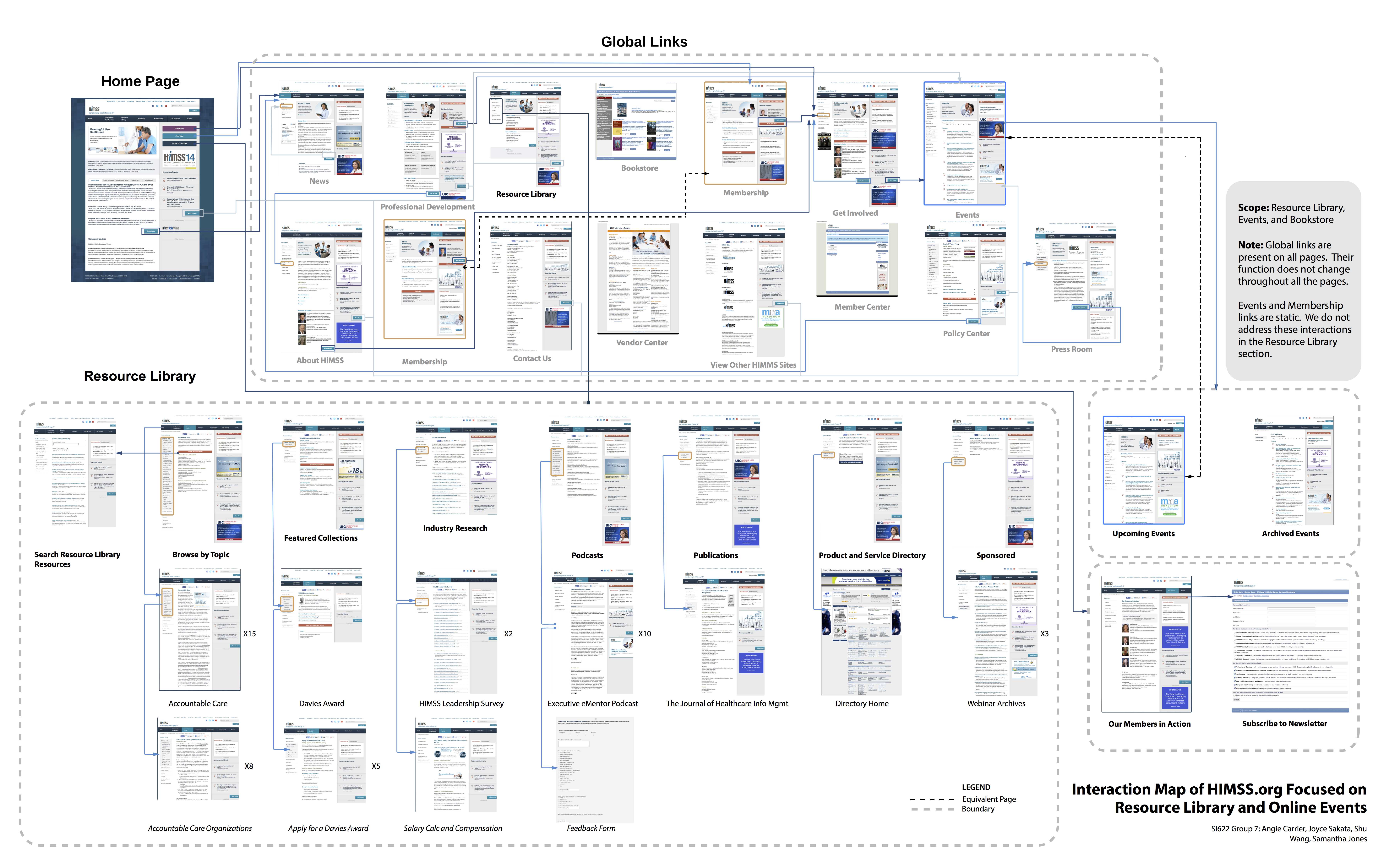
The website is both broad and deep. This may make the site difficult to navigate.
Several links are duplicated and lead to the same page but are titled differently including: membership and events. This may cause the user some confusion.
Many of the pages are long and require excessive scrolling. Additional research will be needed to learn if this is problem for users.
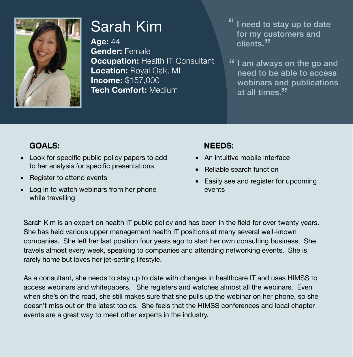
We conducted seven interviews with current himss.org users about their work, their usage of the website, and how they look for information on the website. Our seven interviewees provided us with a range of information about their experiences regarding the website. From these interviews, we consolidated the data into three personas and three scenarios that capture information about the users’ goals, aptitudes, and use of himss.org. We use these personas and scenarios to better illustrate the system’s user population and the ideal outcomes of user interaction with the site. Based on these interviews, we found that many users access only a limited portion of himss.org, users receive poor search results from the site's search engine, and there is a liited awareness of the Resource Library as a specific area among users.

We conducted a comparative analysis of the himss.org website against six other websites which were either direct, indirect, partial, or analogous comparators to himss.org including: HealthIT.gov, HIStalkU Healthcare Resources, Health Data Management, US Green Building Council, American Medical Association, and Pew Research
Several comparator sites offer user-based navigation, and have fewer, more clearly labeled global links many users access only a limited portion of himss.org
Comparator websites that used search engines powered by google or bing offered users more advanced search and filtering functions and better search results.
Comparator websites that introduced related content into their sidebars during search and article display provided a better browsing experience for users.
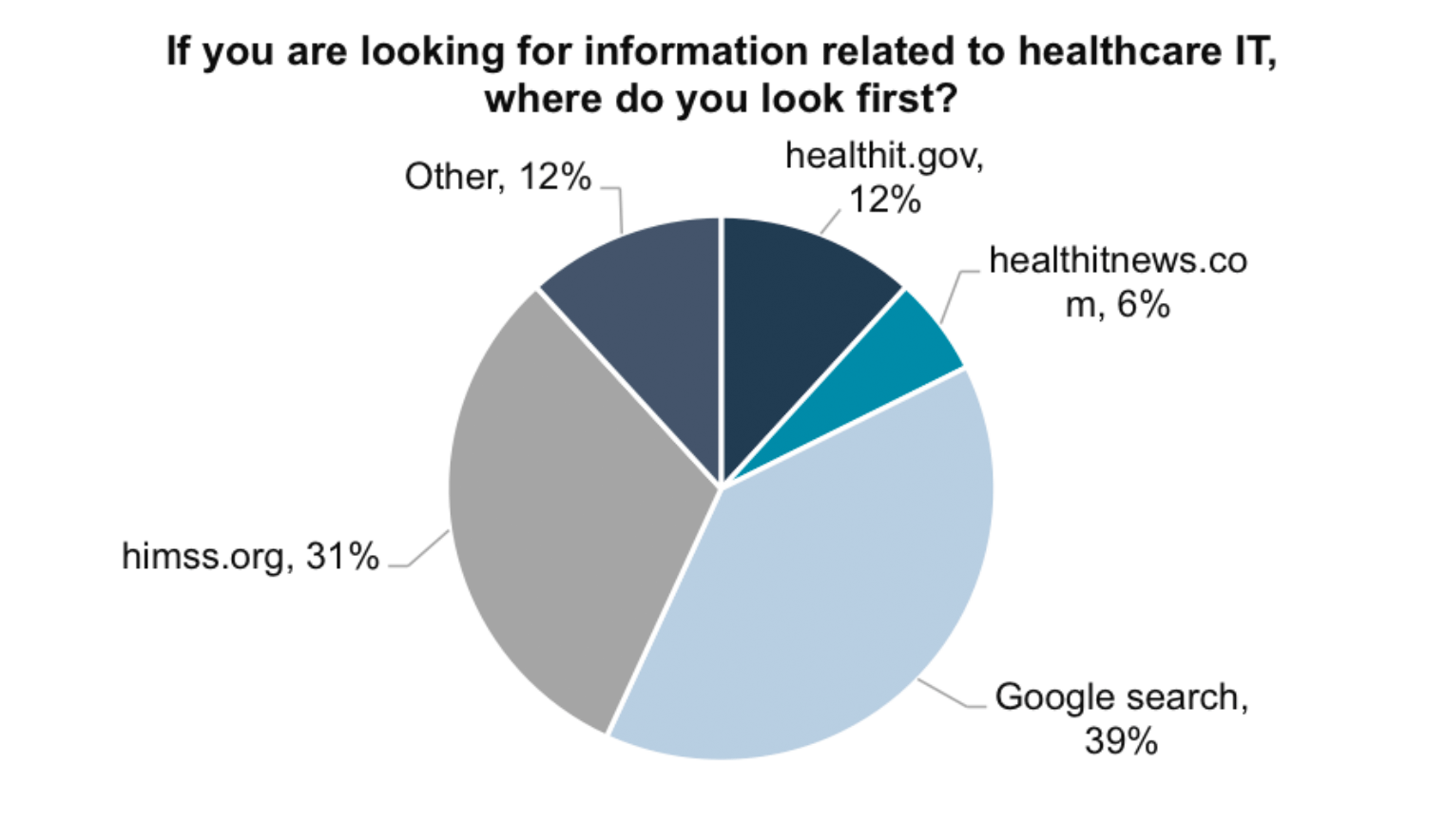
We conducted a survey with the goal of better understanding how himss.org users find information on the website, what type of information users are looking for on the website, and the challenges that users face with the website’s search function. We also gathered information about frequency of visits to himss.org, usage intensity on various sections of the website and demographic information about website users for comparisons and cross tabulations. Through our HIMSS client contact, we sent out a total of 700 survey invitations and received 51 responses.
Goals and usage intensity of different sections of the website vary between professional groups.
Users prefer to search, so search improvements and investigation into sub-par menu navigation should be prioritized.
Adjustments to search phrasing are often necessary regardless of desired information type.
We evaluated the himss.org Resource Library according to “Nielsen’s Ten Usability Heuristics for User Interface Design”
The site can use more whitespace to assist readability of the site.
Colors and styling of the existing website elements are inconsistent
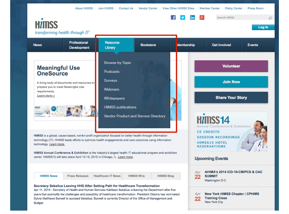
The left-hand sidebar in the Resource Library, which expands vertically as a user moves between sections, is disorienting to users, and could be simplified or eliminated.
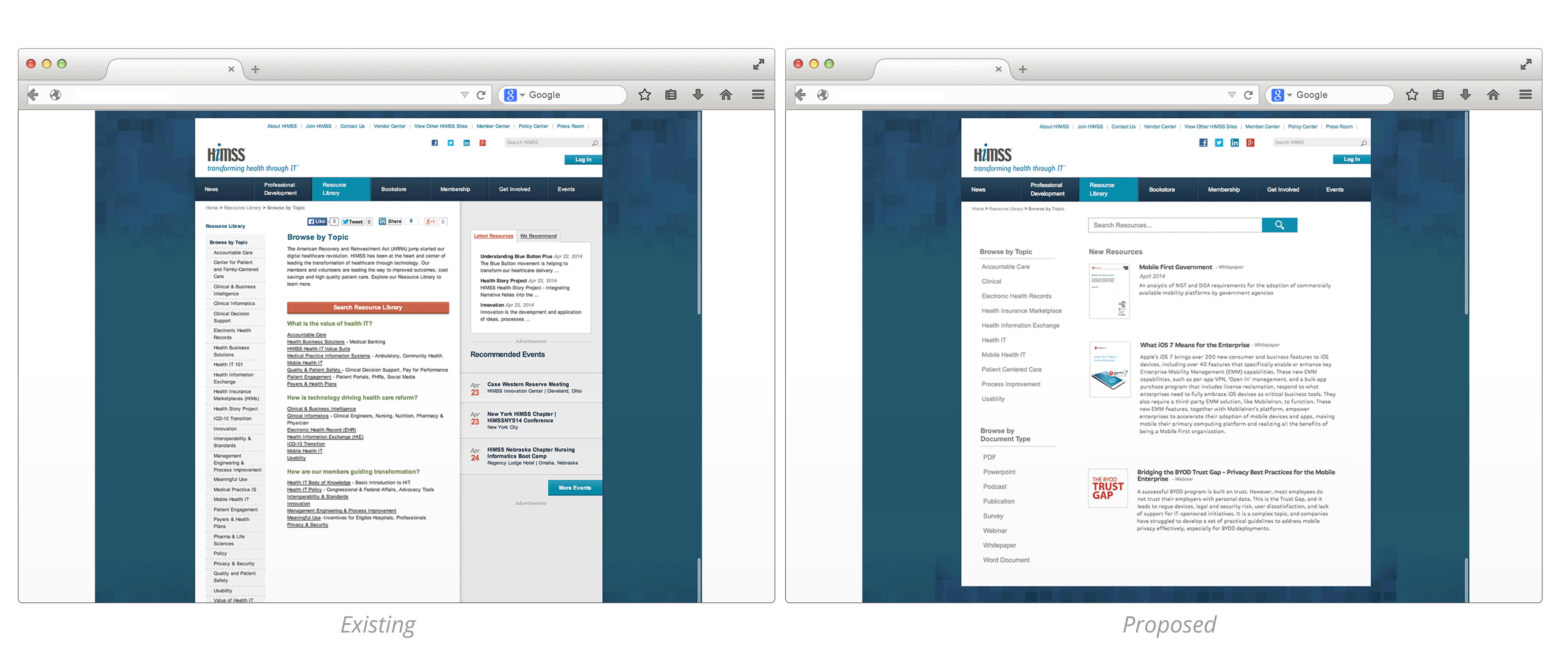
The Resource Library “Browse by Topic” homepage does not facilitate browsing due to its lengthy left‐hand sidebar, prominent “Search Resource Library” button, and vague list of links.
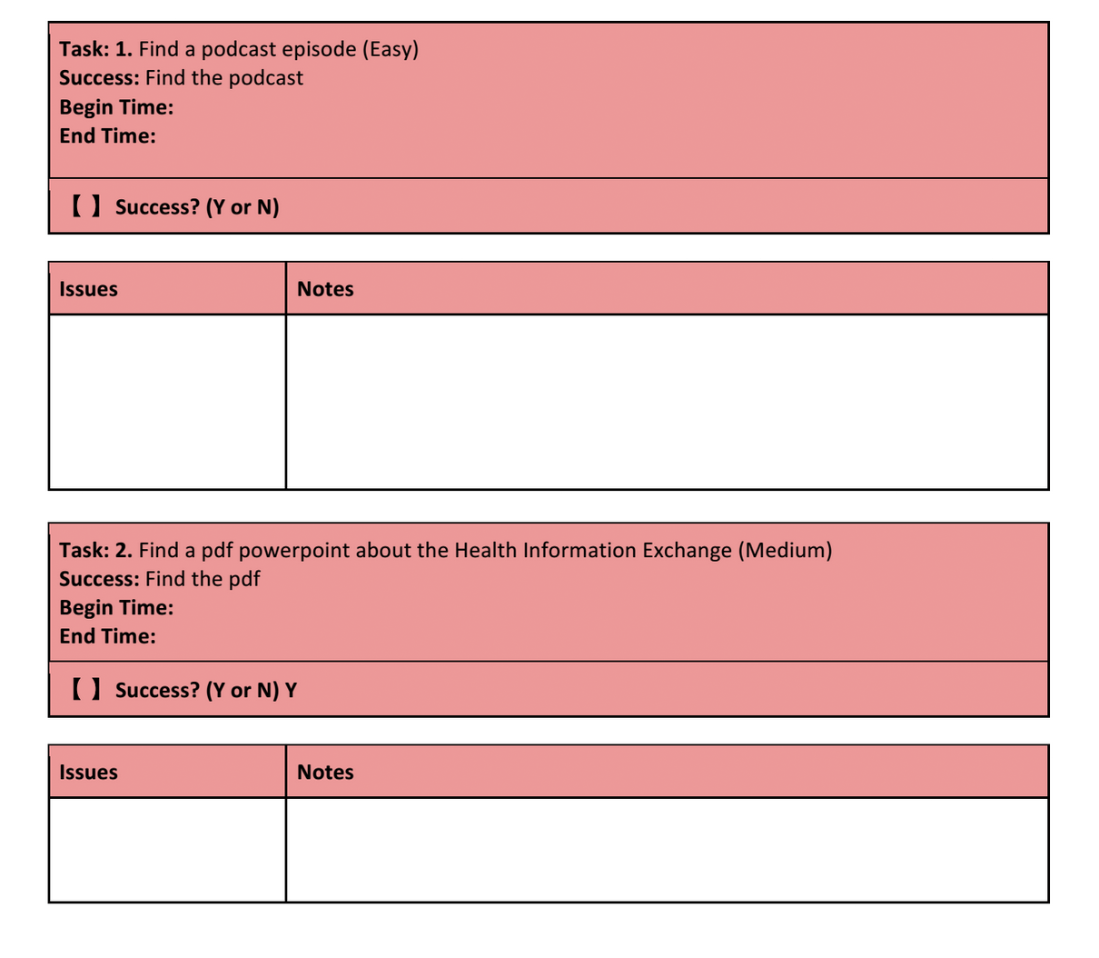
We created a usability test that included eight tasks focused on finding information in the Resource Library and Events section of himss.org. We conducted this test on six himss.org users: four low-intensity users and two high-intensity users.
Poor results reduce confidence in search.
Resource library category terminology does not match natural language
Webinar designation as a type of event does not match users’ mental models
Many page clicks are required to find documents
Page loading speeds are noticeably slow
We made recommendations based on our findings through our user research. We created wireframes to illustrate how our findings could be used to improve the usability of the site.
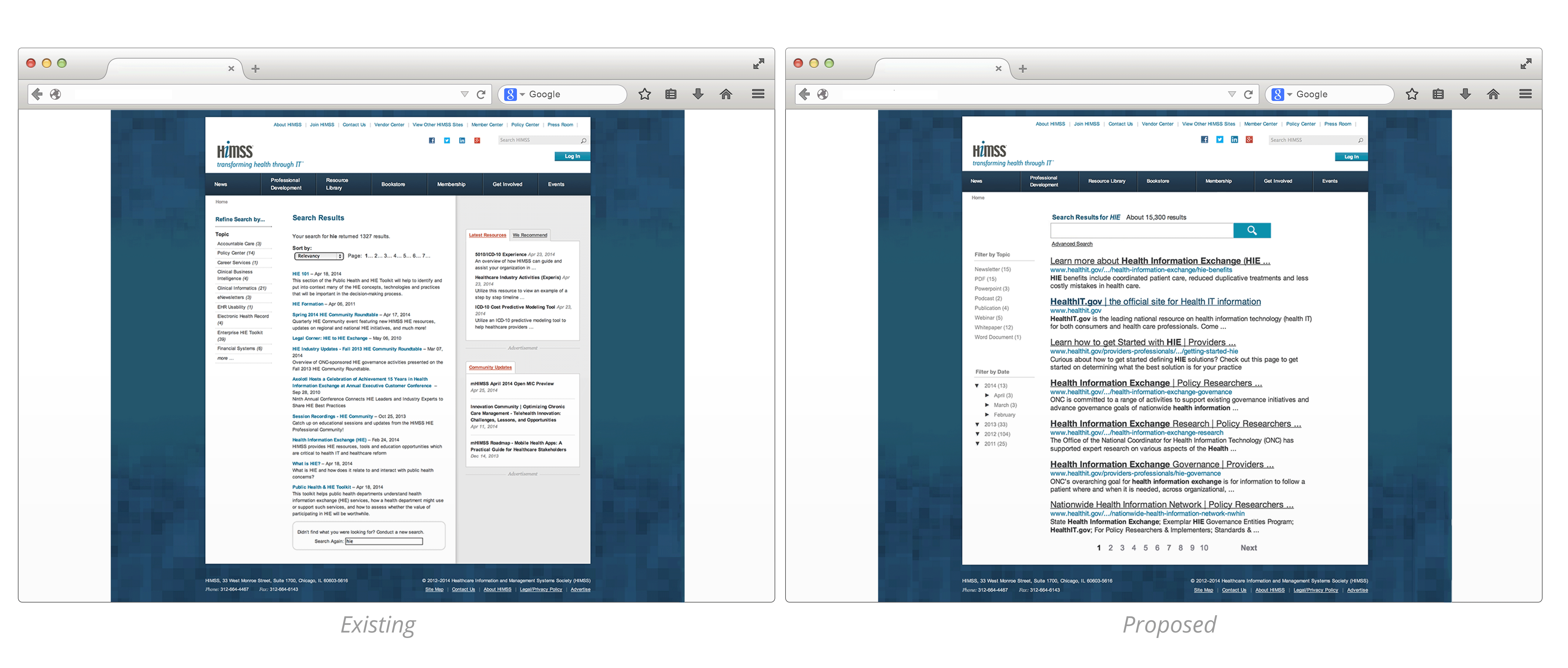
Survey respondents indicated a preference for using search versus browsing. This suggests that improvements to the heavily used search function should be prioritized. During many usability tests, users were unable to find their target document after typing in a search query and had to make amended search queries.
In our mock-up, we show HIMSS employing a more robust third-party search engine. Search results display bolded keywords in the document and the url information to help users find the most relevant documents.We introduced advanced sorting and filtering options including: filtering by document type and by date. These improvements will help users find specific documents like whitepapers, reduce the need for users to change search terms, and increase user confidence in the accuracy and relevancy of the results.
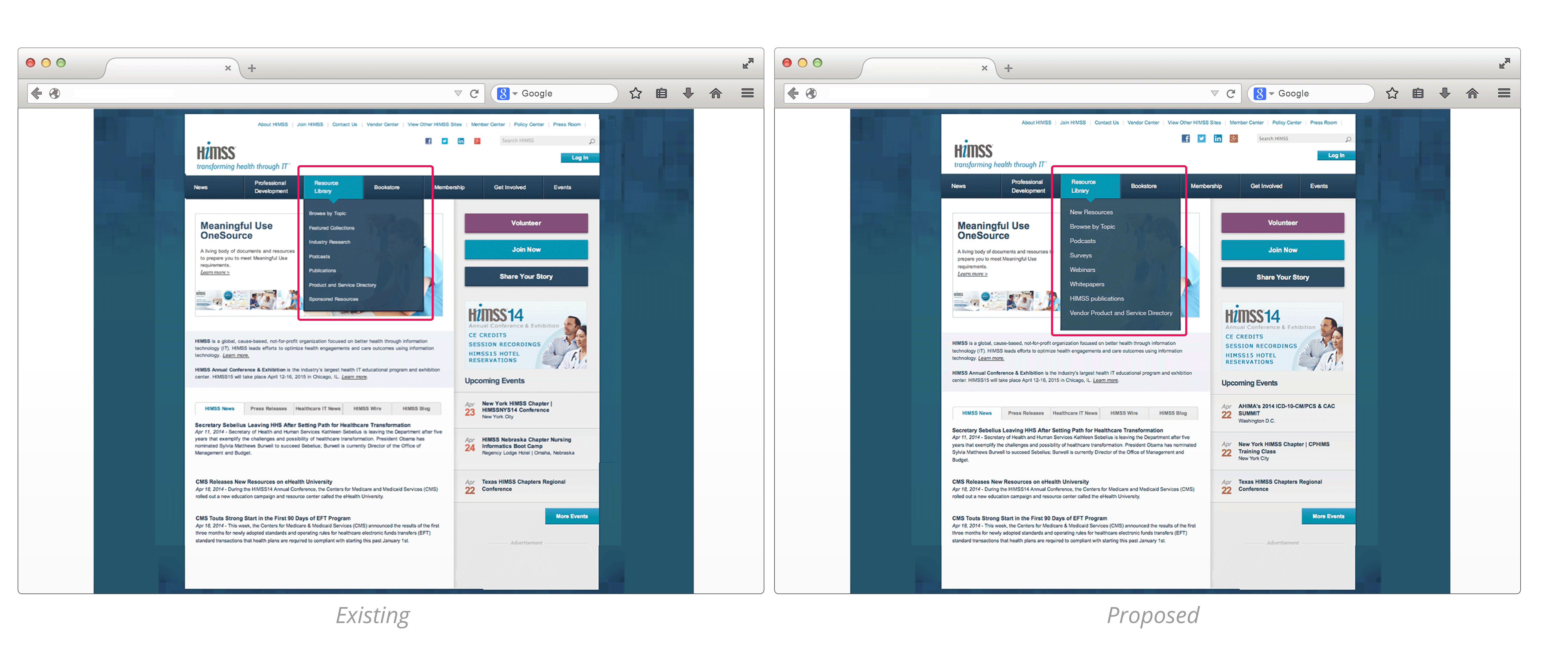
Heuristic evaluation and user testing revealed a number of challenges in the navigability and readability of the Resource Library. For example, the category terms in the Resource Library’s drop-down menu do not match users’ natural language. During several of our tasks, users hovered over the Resource Library for several seconds considering the categories before deciding to use the search function. Users vocalized specific confusion with the terms “Sponsored Resources” and “Featured Collections.”
In this mockup we revised the Resource Library’s drop-down menu terms to match users’ mental models. The Sponsored Resources category, which held Whitepapers and Webinars, now have their own categories under Resource Library. Surveys and HIMSS publications have also been put into their own categories. By revising the Resource Library’s terminology, we can promote ease of navigation to these In-Demand documents.
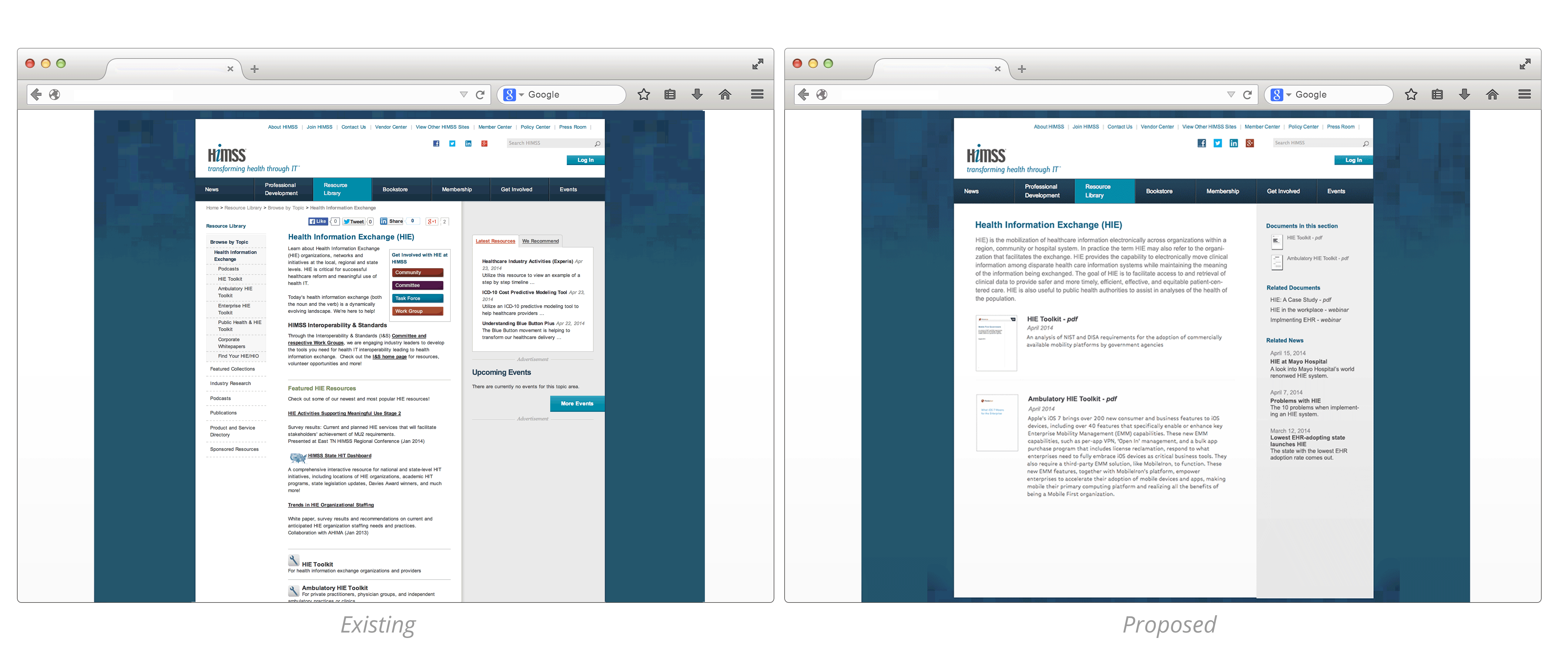
The Resource Library “Browse by Topic” homepage does not facilitate browsing; rather, it consists of a prominent “Search Resource Library” button and vague list of links that repeats content from its left-hand sidebar. This left-hand sidebar, which expands vertically as a user moves between sections, is disorienting to users and could be simplified or eliminated.
In this mock-up, we show consolidated topic categories and improved visibility of in-demand documents. We feature a standard search bar for the resource library search. Users are able to filter by document type and see recent publications. These changes will improve content readability and browsing of in-demand documents.
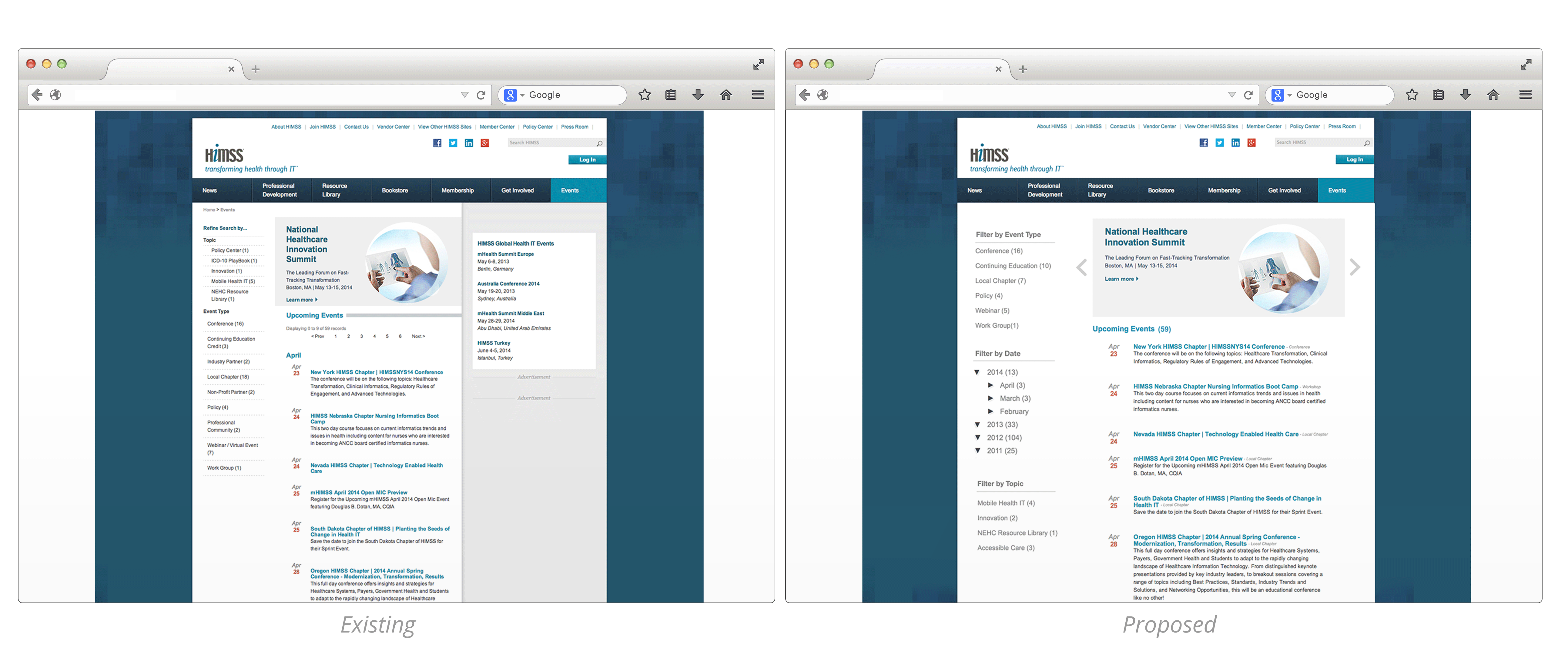
User testing suggested that users do not instinctively designate webinars as events, as several users either looked outside the Events navbar link or used the search function in order to find webinars. Furthermore, when looking for past webinars, several users were frustrated with the Events Archive page, which lacks the sorting and filtering abilities present on the Upcoming Events page.
In this mockup, we show what the events page could possibly look like with a sidebar of filtering and sorting options, such as by event type, topic, and date. The large header image can display featured events and the removal of the second sidebar improves the clarity and readability of the site.
The user browsing experience could be further customized with another strategy employed by comparator sites: reactive sidebars. On himss.org the sidebar remains static for both articles and search results pages. Usability research has demonstrated that sidebars get significant reader attention. We believe that if the sidebars introduce sidebar content that reacts to the keywords of a user search or the topic of an article, this display will facilitate content discovery and provide a better browsing experience for users.
In this mockup, we show how himss.org could use reactive sidebars to facilitate browsing. In this example, we expanded the content area and introduced a reactive sidebar that includes documents located in this particular HIE section, related documents, and related news. These changes can help users navigate through the topic page to find relevant and related documents and news.